Forging a brand built for the work.
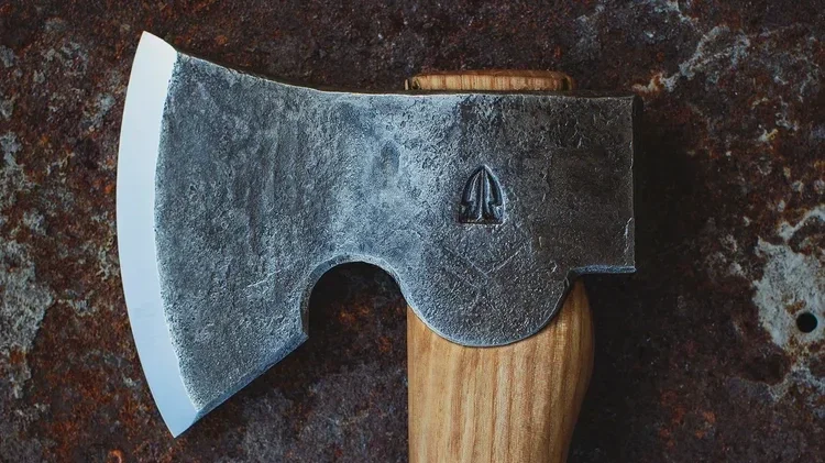
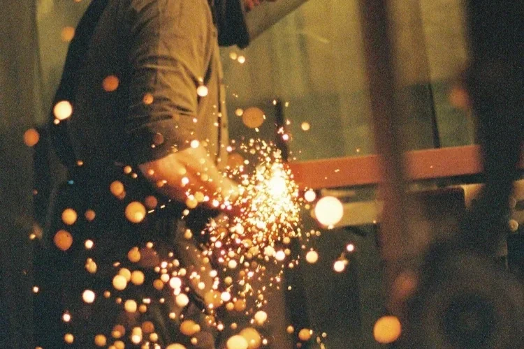
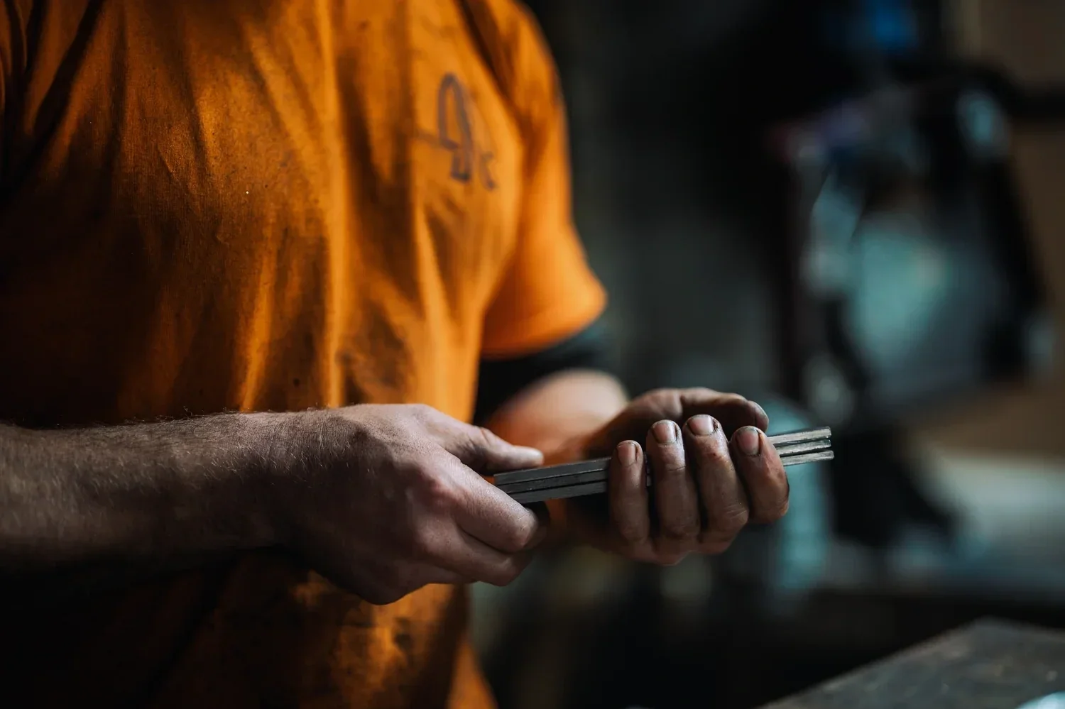
Thorn Wood Forge creates exceptional British hand-forged tools from its workshop in the Somerset countryside. Combining traditional blacksmithing with contemporary materials and a relentless focus on performance, every axe and knife is designed to work hard, age well and endure generations of use.
The quality was already there. Our job was to build the brand system around it.
-
Thorn Wood Forge had earned a strong reputation through the skill of its makers and the performance of its tools. But as the business prepared to grow its direct-to-consumer offer, its identity had not yet developed into a complete brand system.
The existing expression moved between traditional craft, outdoor lifestyle and premium product without clearly owning any one space. There was no consistent structure connecting the logo, language, product information, campaigns and customer experience.
The challenge was not to reinvent Thorn Wood. It was to identify what made it distinctive, remove what did not belong and create a brand capable of carrying the same authority as the tools themselves.
-
Brand Audit, Brand Strategy, Positioning and Messaging, Visual Identity Evolution, Logo Refinement, Typography and Colour Systems, Graphic Language, Tone of Voice, Brand Guidelines, Product Launch Creative, Shopify Strategy, Design and Build, Copywriting and Content Direction, SEO and Website Migration.
-
We began with a ground-up audit of the brand, its audience, its competitors and every existing customer touchpoint.
That process revealed a clear opportunity. In a category often dominated by rustic nostalgia, lifestyle theatre and heritage clichés, Thorn Wood could occupy a more focused position: a modern British toolmaker defined by purpose, precision and material honesty.
We distilled the brand around three ideas: function first, earned confidence and clarity over noise.
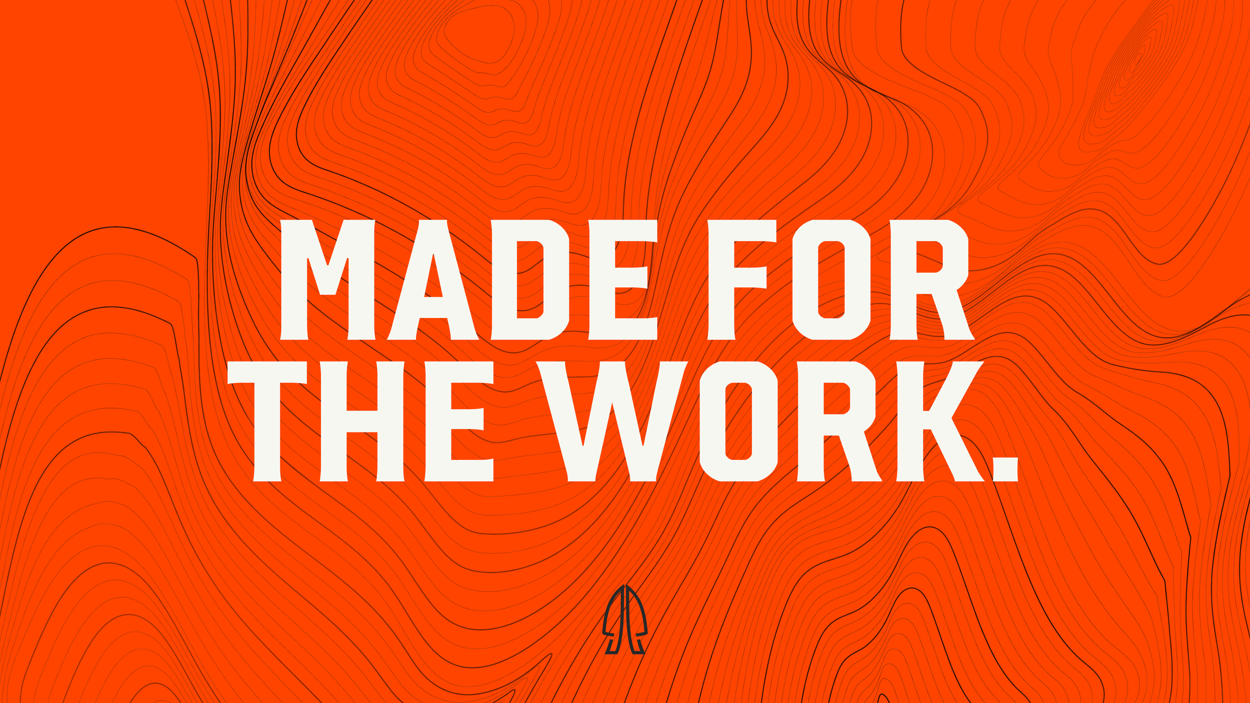
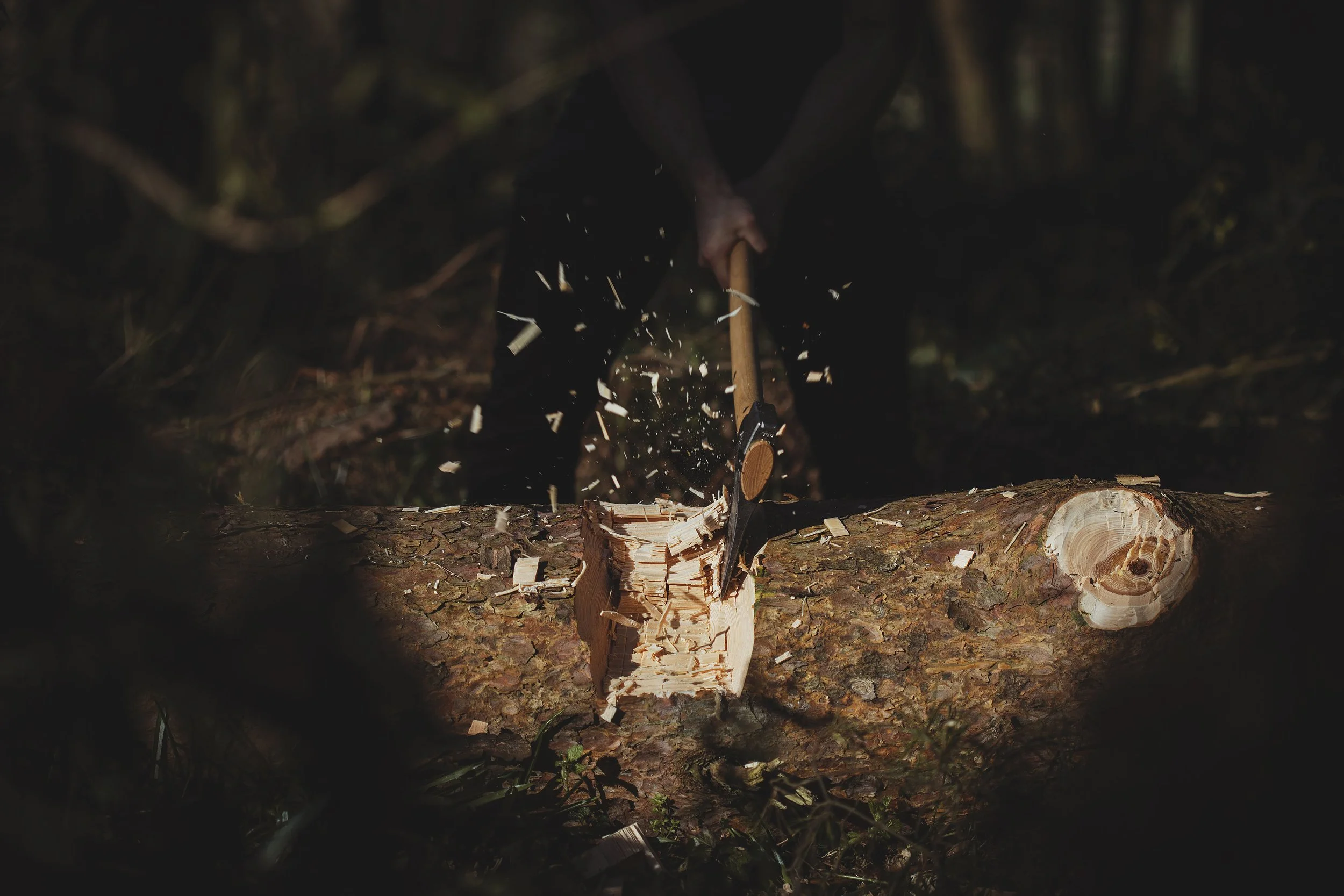
“Made for the Work.” became the organising thought behind the system. It captured the performance of the products, the discipline of the makers and the straightforward character of the business in four words.
The resulting direction was engineered rather than styled. Considered rather than ornamental. Premium without indulgence. Outdoor without theatre. Craft without costume. Performance without noise.
-
We evolved the existing identity rather than erasing its history.
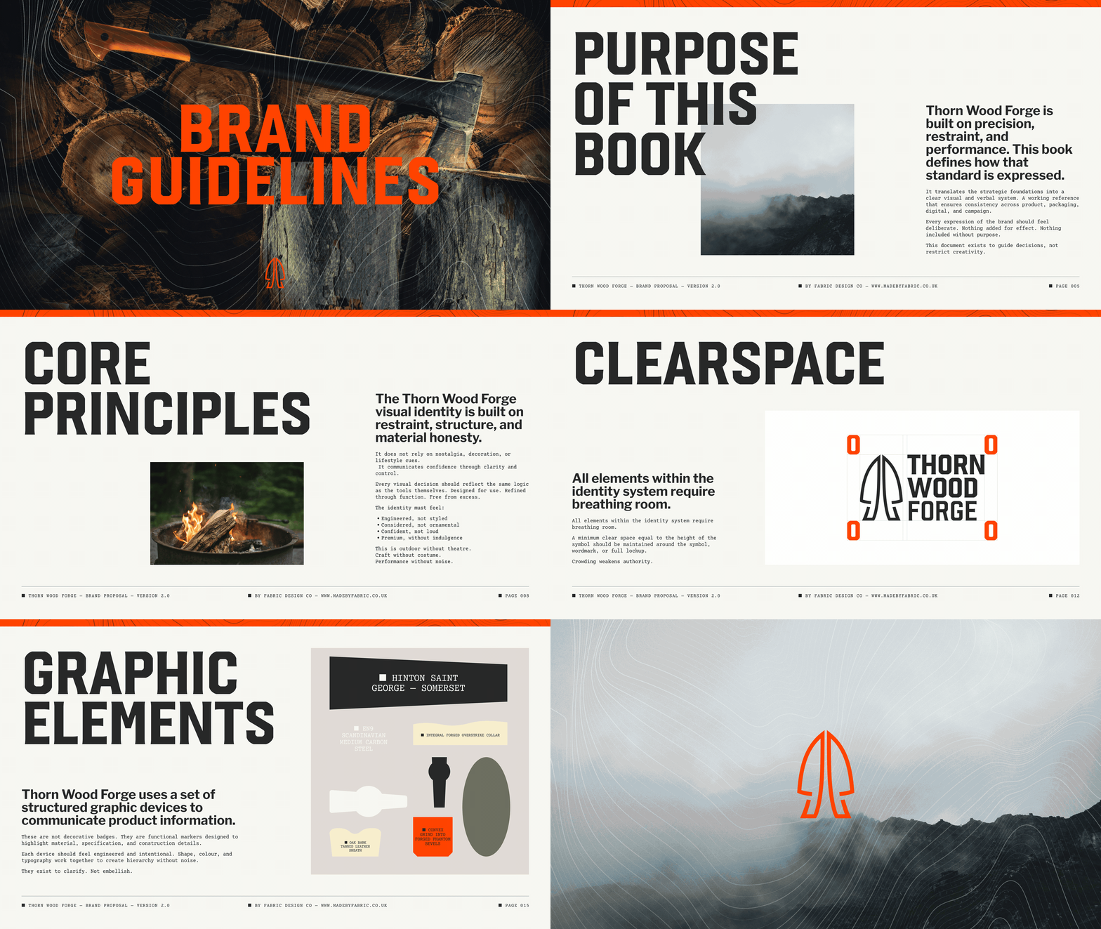
The Thorn Wood symbol was simplified and amplified to create a stronger mark capable of holding its own at any scale. The wordmark became heavier, sharper and more industrial, giving the complete lockup greater confidence and clarity.
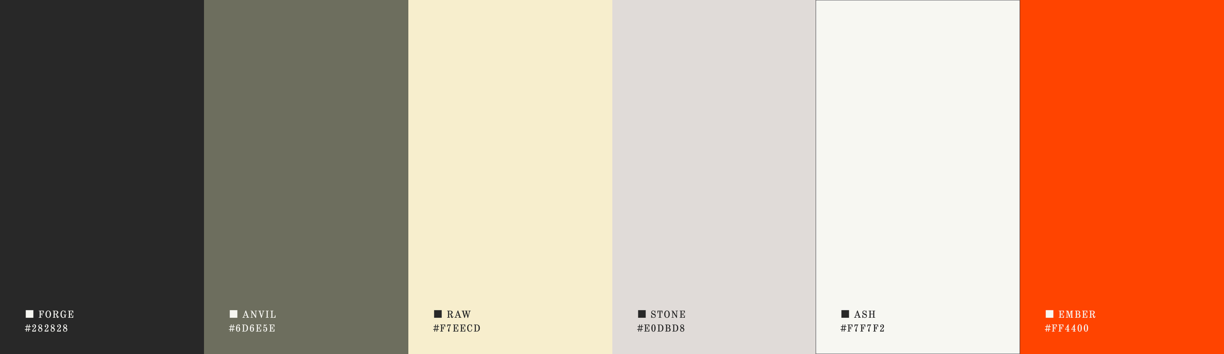
A restrained palette drawn from steel, timber, stone and heat created a visual connection to the materials and processes of the forge. Forge black and natural neutrals establish the foundation, while Ember orange introduces controlled moments of energy and recognition.
We developed a contour graphic inspired by blade geometry, cut timber and topographic mapping, alongside a suite of structured product markers and icons. These elements were designed to communicate material, construction and performance without becoming decorative badges.
The identity was carried through into a complete Shopify experience, bringing product architecture, technical information, brand storytelling and course bookings into one coherent system. The result is a store that feels distinctly Thorn Wood while remaining straightforward for the team to manage and grow.
-
Thorn Wood Forge now has a complete brand system built with the same discipline as its products.
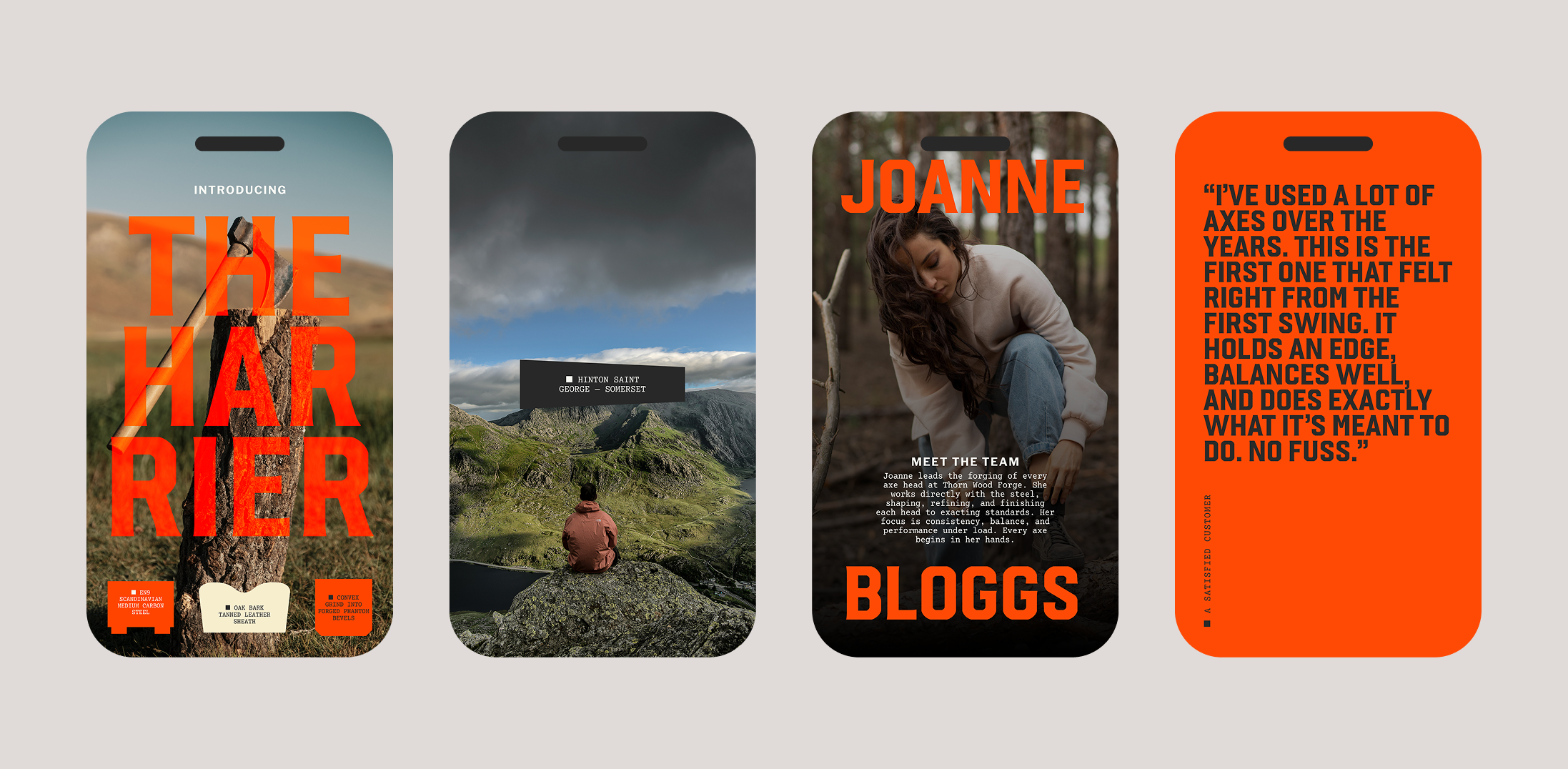
A sharper identity, distinctive visual language and clear verbal position connect everything from campaign creative and technical product communication to the full ecommerce experience.
The business has moved from an organically assembled collection of assets to one coherent, ownable brand: practical enough for everyday use, strong enough to support growth and unmistakably made for the work.