Loud cans. Louder character.
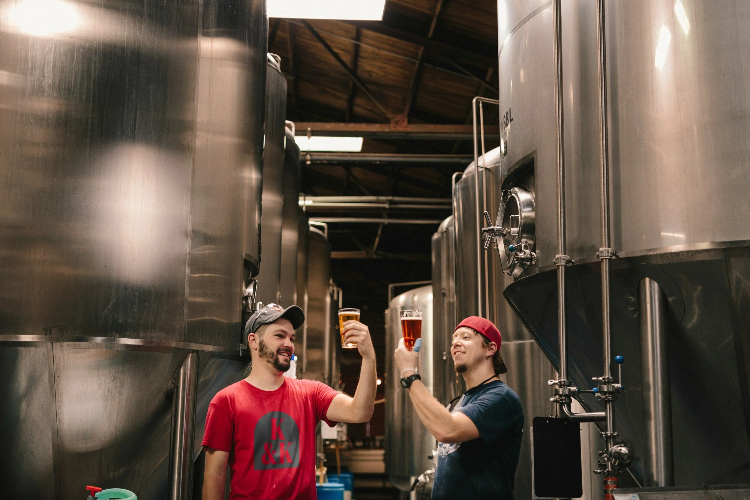
Krafty & Krafty is a Birmingham-based brewery specialising in dank, hop-forward beers in 440ml cans. Known for their unapologetically strong flavour profiles and fiercely independent ethos, Krafty & Krafty is carving a space in the craft scene for drinkers who want substance and style in equal measure.
-
The beer world is saturated with colour, illustration and whimsy. Krafty & Krafty needed to cut through that noise with something sharper. The ask was for a brand that felt confident, uncompromising and unmistakably local, without relying on tired beer tropes or clichés.
-
Brand Strategy
Visual Identity
Art Direction
Packaging Design
Typography System
Brand Guidelines -
This was about embracing attitude. Birmingham’s industrial past, straight-talking personality and DIY spirit shaped the brand strategy. We wanted the beers to feel like street-level statements – less craft, more graft. The tone is direct, the look is punchy, and everything points back to boldness in taste and brand.
-
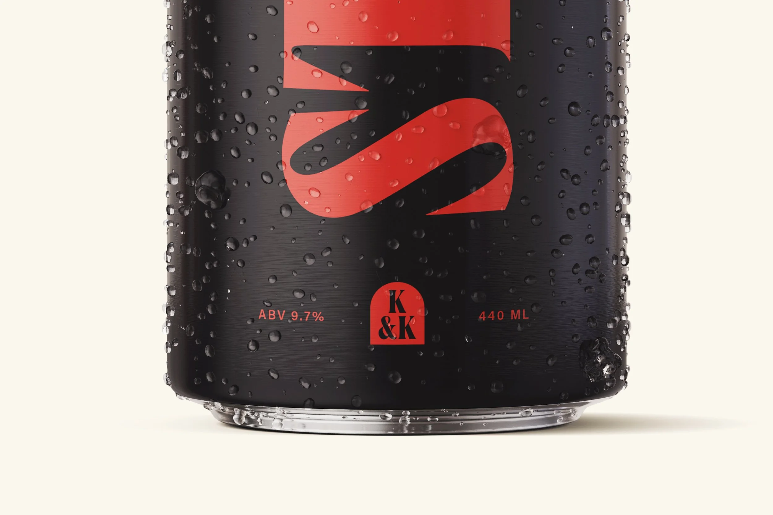
The identity is monochrome at its base, with sharp, custom typography that carries weight across cans and communications. Flashes of red break up the black-and-white system, injecting intensity and immediacy. The visual language is deliberately type-driven – no illustration, no fluff – letting the words and flavour do the talking. Brutalist layouts and heavy textures give everything a raw, grounded presence.
-
The new brand has helped Krafty & Krafty establish a clear, ownable voice in an overcrowded market. With the full can range rolled out and expanded distribution across the Midlands, the visual system has scaled across taproom, web, social and merch with ease. It’s bold, brash and built to last.