Designing for soul, mind and screen.
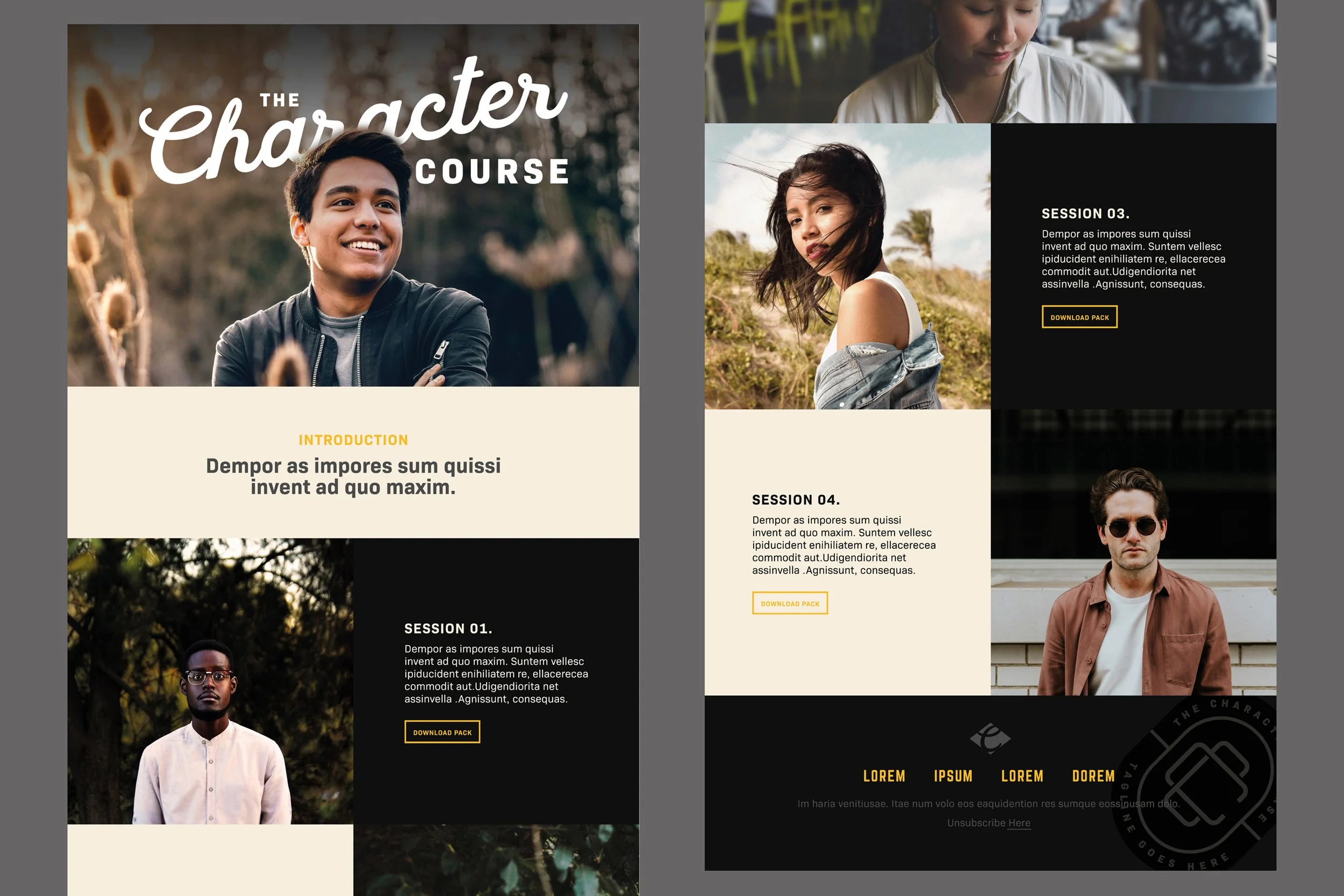
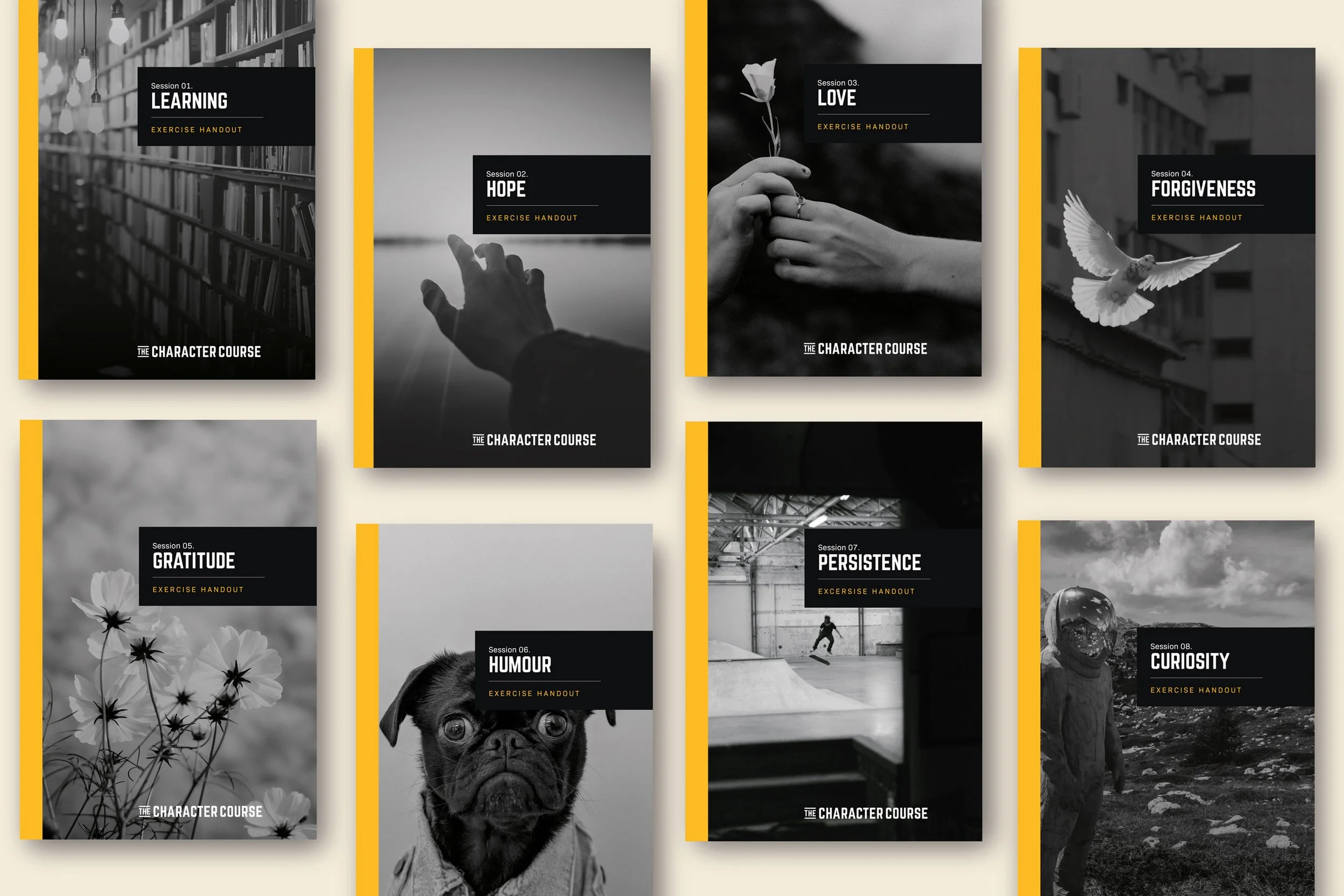
The Character Course is an eight-week discipleship programme that blends contemporary psychology with ancient biblical wisdom. Developed by psychologist Roger Bretherton and filmmaker Rick Holland, the course guides participants through themes like hope, forgiveness and persistence, delivered through film, discussion and practice. It’s free to access, globally available, and designed for flexible use by churches, small groups or individuals.
-
The course had a clear voice and valuable content, but no visual system to match. We needed to create a simple, recognisable identity that would connect with a diverse user base while integrating seamlessly with the video content. The brand had to be trustworthy, warm and easy to use, without overpowering the message.
-
Visual Identity
Logo and Lockup
Typography
Colour System
Brand Guidelines
Digital Design Direction -
We approached the project with restraint, building a brand that quietly supports rather than overshadows the content. Our strategy focused on accessibility and clarity, meeting people where they are, regardless of age, background or tech-savviness. It needed to feel universal, but deeply personal.
-
The identity is monochrome at its core, using expressive typography to hold attention and guide focus. A flash of optimistic yellow brings warmth and character, acting as a visual anchor throughout the experience. Layouts are minimal and prioritise usability, keeping participants engaged with the course itself. The design is quietly confident, echoing the stillness and clarity of the content.
-
Since launch, The Character Course has been downloaded and used by groups across the world. The brand has helped open the course to new audiences, making it easier to share, easier to start and easier to stick with. What began as an academic project is now a practical tool for community, reflection and change.